
Reporting Tool for Wealth Managers
UX & Research Lead · Capco Digital · 2019
A major wealth management firm's financial advisors relied daily on a proprietary portfolio management reporting tool to prepare for and run client review meetings. After years of grafting on more and more features, settings, and options, the tool was functional… but it thoroughly frustrated and the people who used it most.
I led a UX and research team of six to design the fix.
The Problem
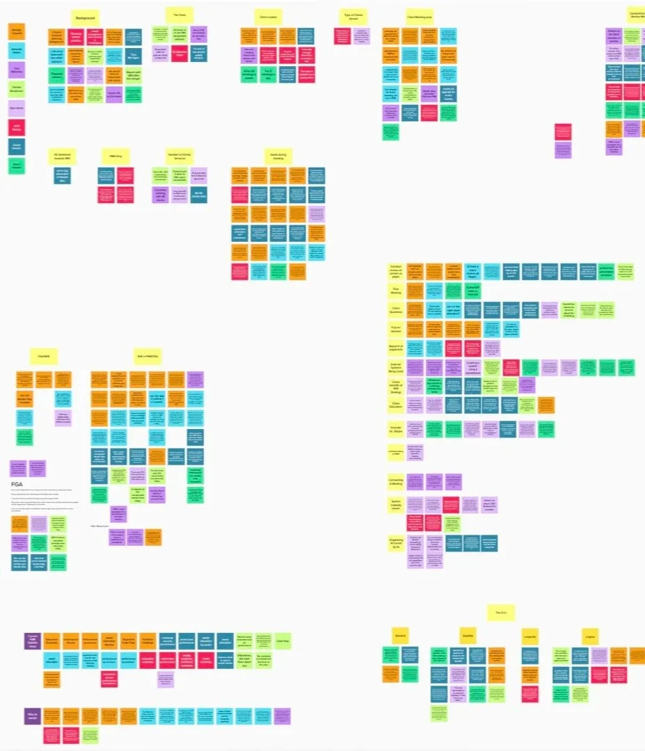
Discovery interviews with internal stakeholders across four teams surfaced four interconnected pain points.
Fragmented access
The features available to an advisor differed depending on where they entered the tool. Same job, different experience.
No data before generation
The tool was vital for portfolio analysis yet the interface showed users nothing until after they’d already run a report, which could take hours.
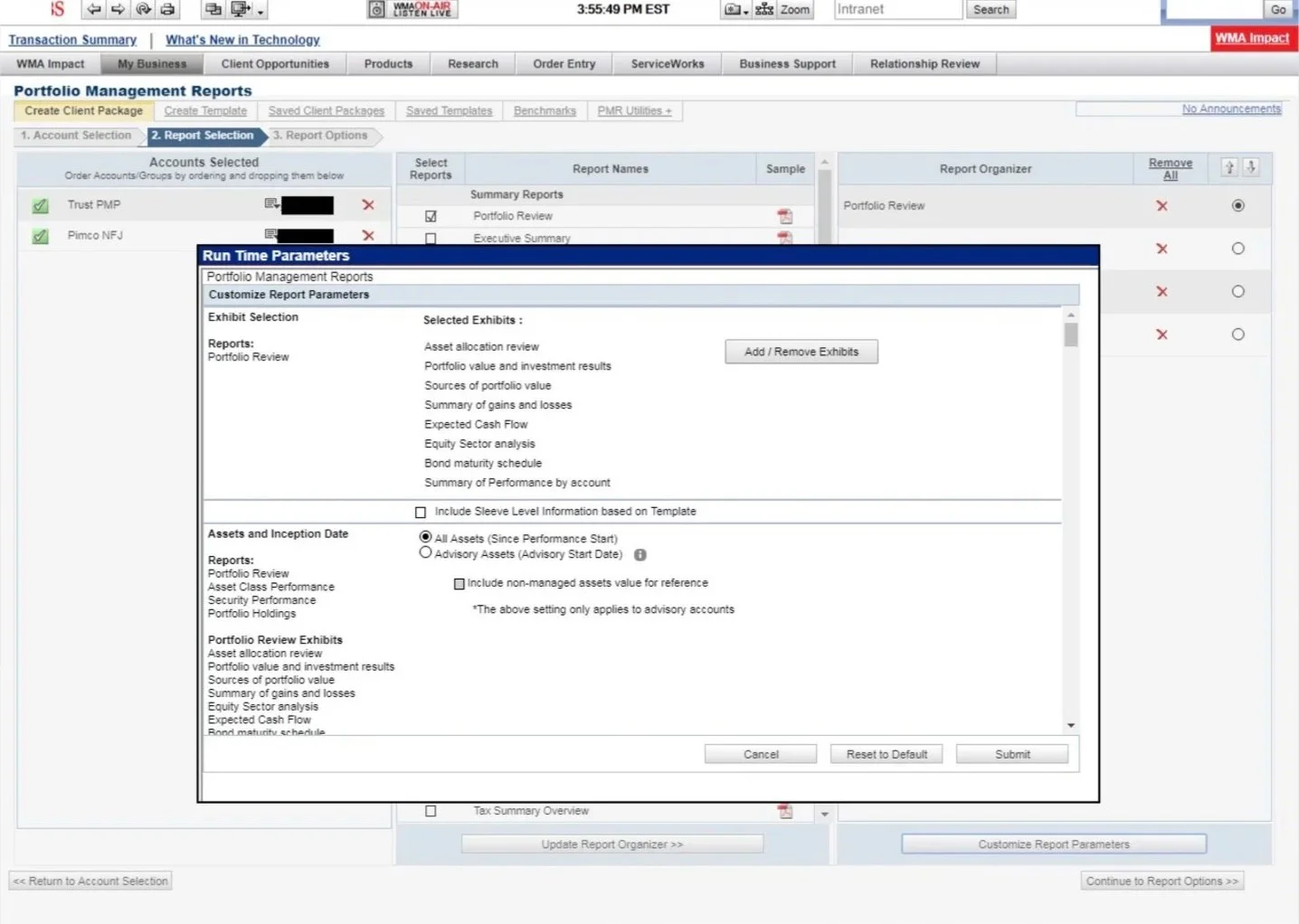
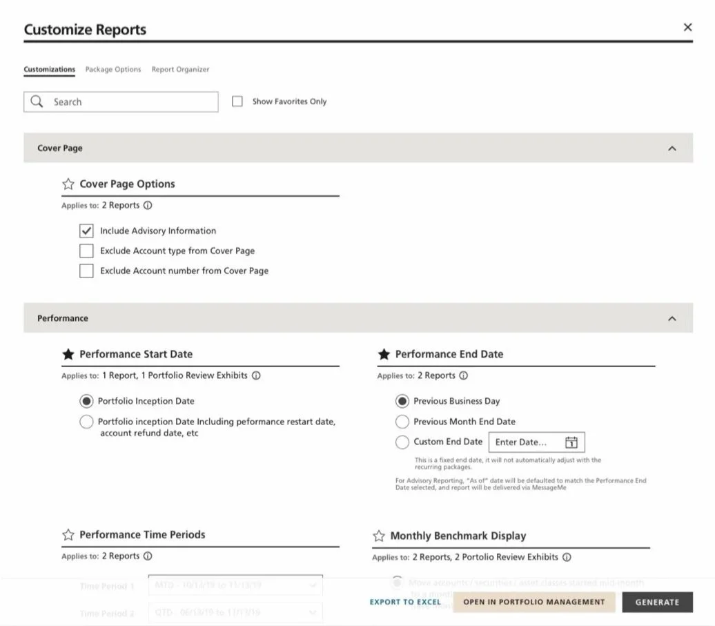
Customization rigidity
Despite a wealth of customization options, there were places of unexpected inflexibility and lack of clarity in how they’re displayed.
Aging architecture
As a natural byproduct of its growth over many years, the interface felt disorganized and opaque, and had a steep learning curve.
Mapping the System
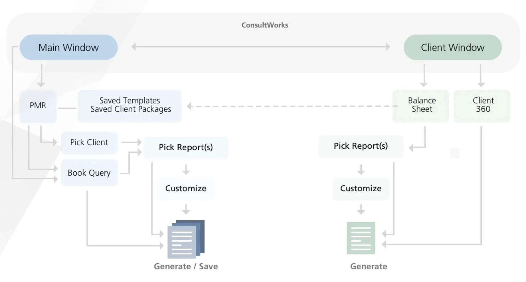
The current state
At a high level, the existing system had two poorly connected experiences initiated from different entry points. Similar underlying capability, different interfaces, different features.
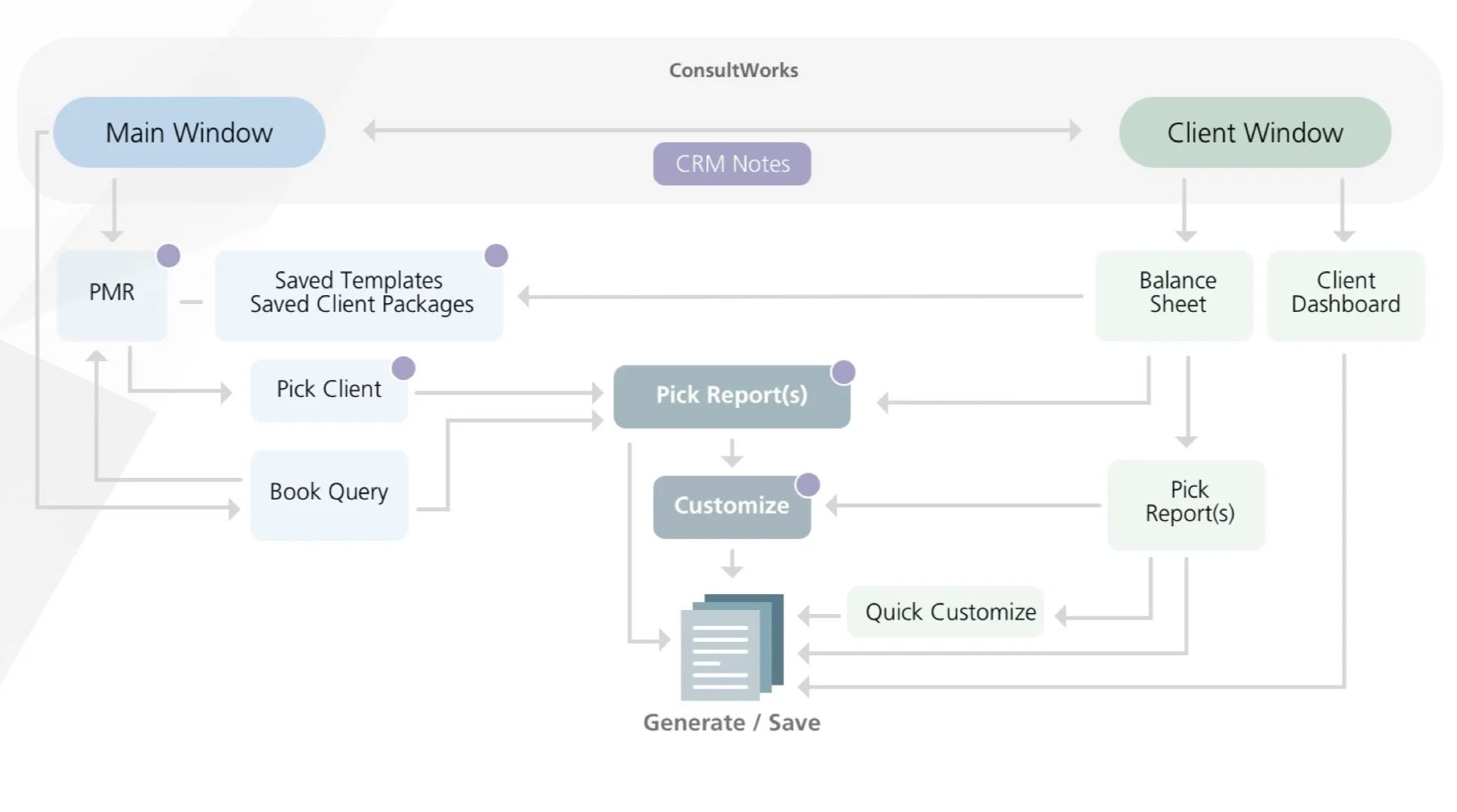
The target state
One experience, accessible from everywhere, with consistent features and a customization model that didn't change based on where you started.
Testing
We built and tested two rounds of prototypes with financial advisors, iterating between each.
Round One (wireframes) validated our overall direction and surfaced the iteration priorities: customization discoverability needed a complete rethink, the report selection flow had a navigation problem, and live data preview needed to be the default — not a click away.
Round Two (high-fidelity, real-scenario) confirmed that the iterations landed and built confidence for final delivery.
Original Interface
Round 1 Wireframes
Round 2 High Fidelity
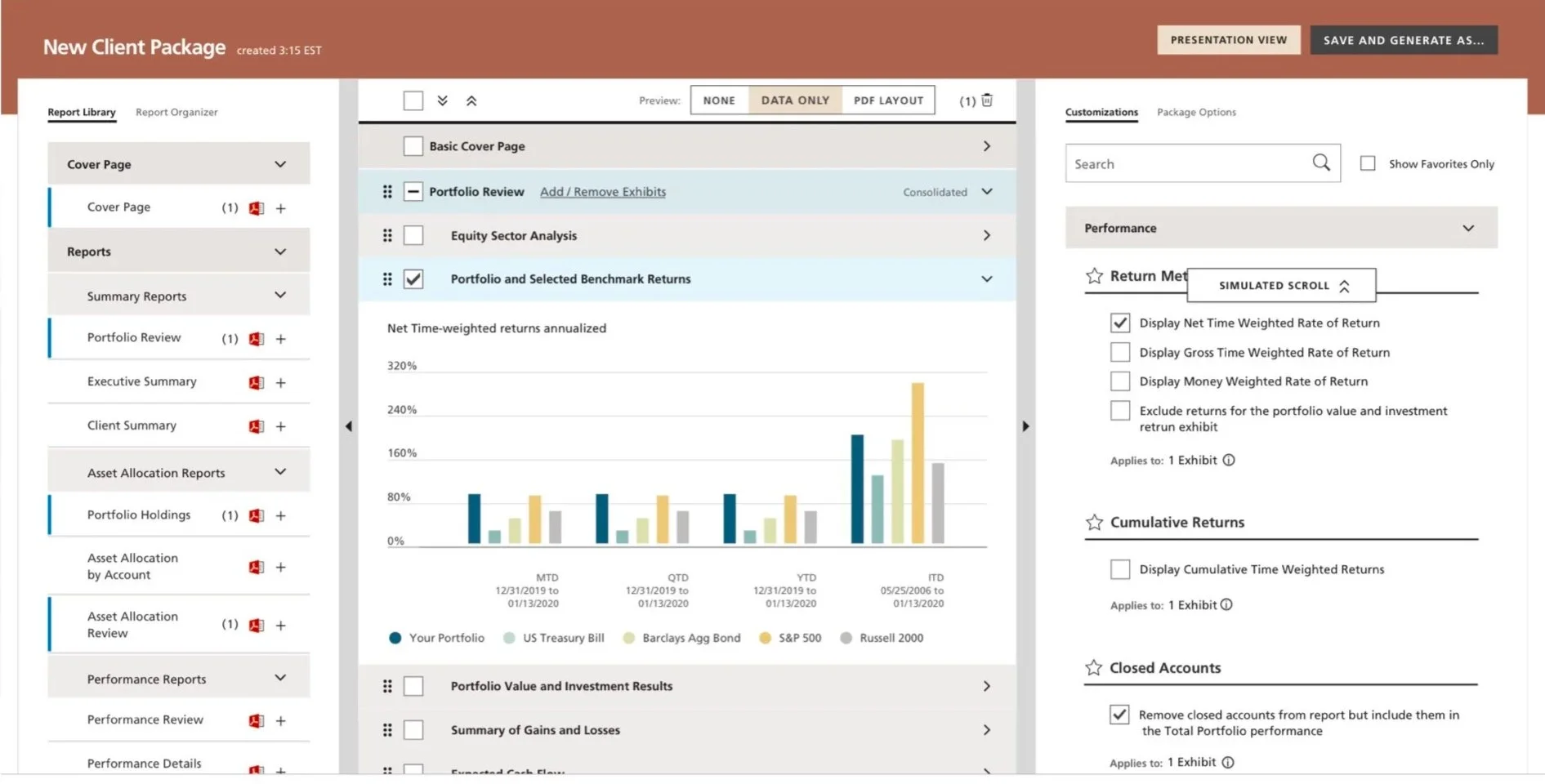
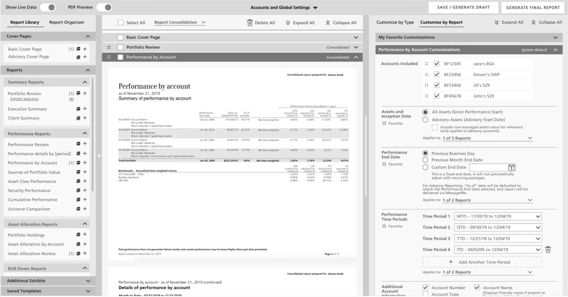
The Solution
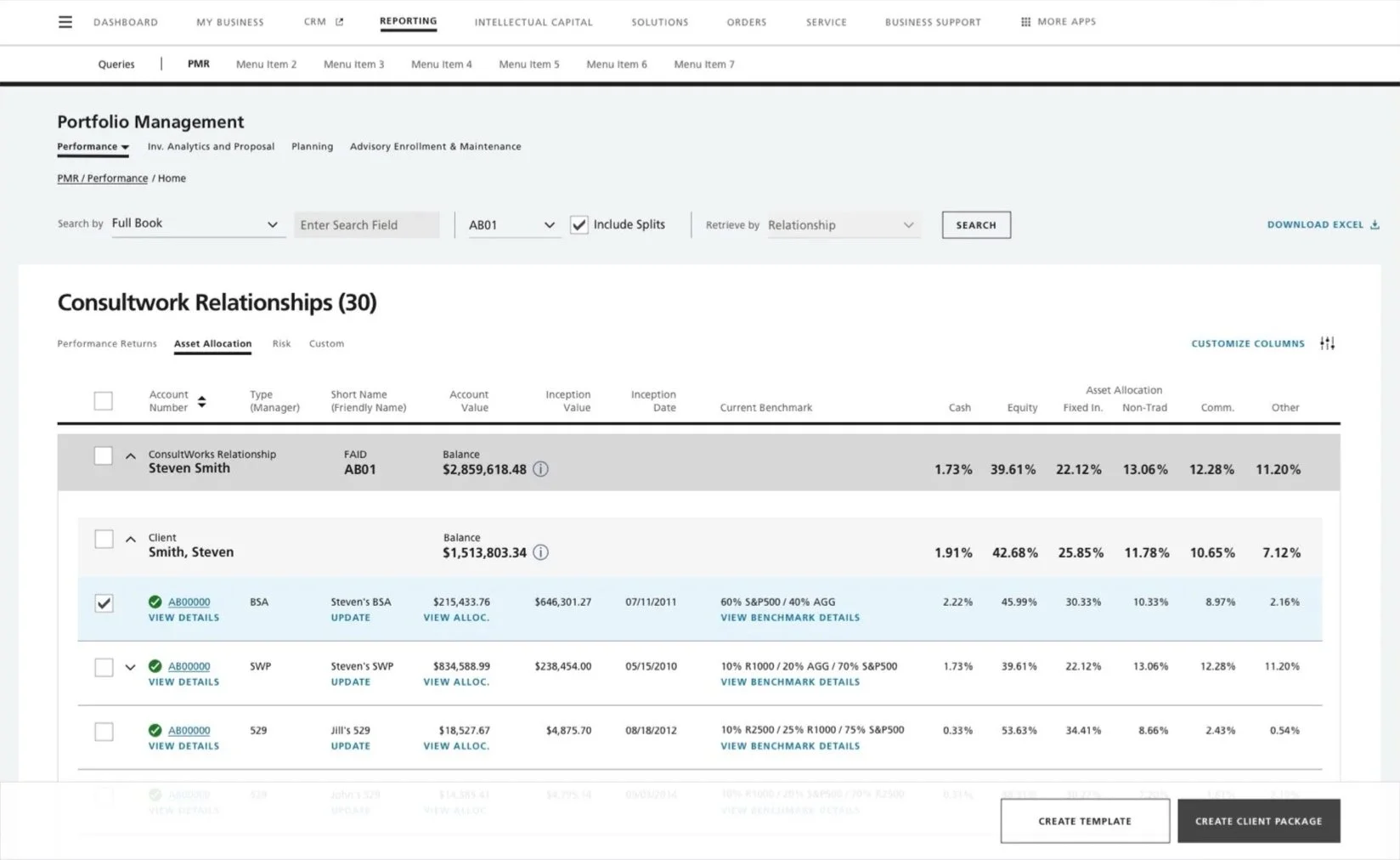
The new Main Window introduced on-screen data before any report generation: a searchable account view with tabs for Performance Returns, Asset Allocation, Risk, and a user-defined Custom view.
Full Book search, Excel export, and relationship/client/account-level data all visible at a glance.
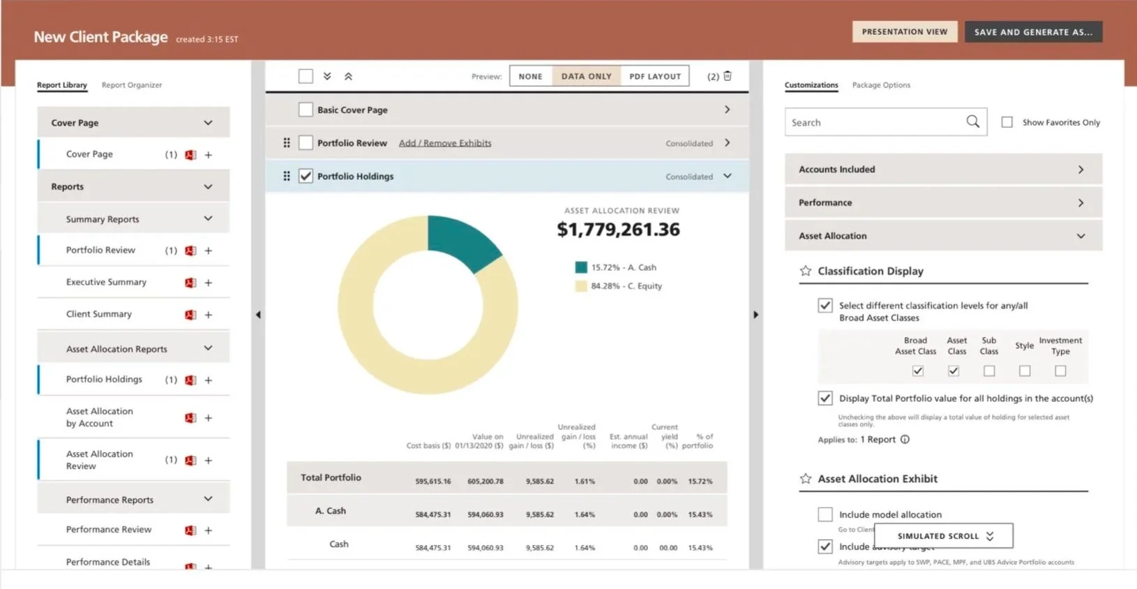
Report building became a single continuous flow: report library, live preview, and a redesigned customization panel — searchable, with favorites and default overrides — all in one place.
No more navigating backwards to complete a forward-moving task, and no more waiting for the report to generate to see the analysis.
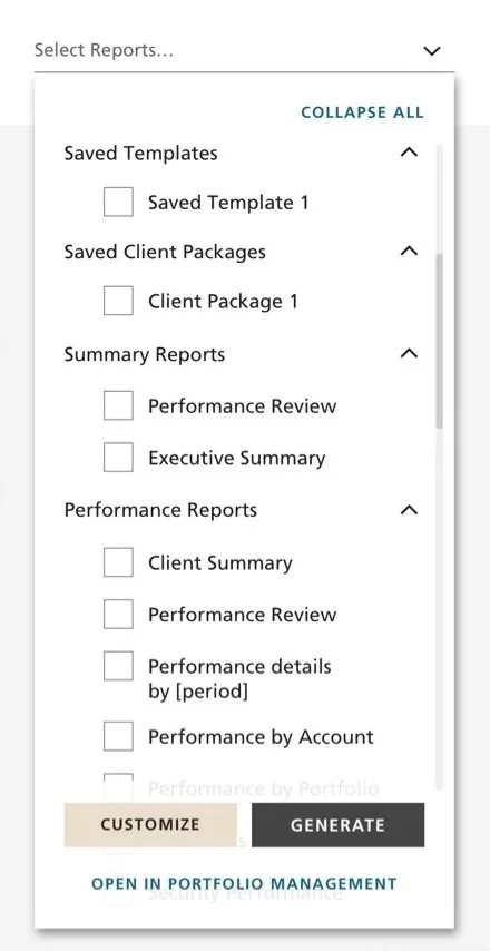
From either of the two access paths, advisors could now select multiple reports and land apply the same customizations.
A less capable version of the tool was replaced with the actual tool, surfaced where advisors already were.
“If you gave me a few hours with this, I could figure it out on my own."
“You guys have gone above and beyond, nothing is unsolved by this.”
“These are the tools we need to put the right reports in front of our clients.”
Outcomes
We delivered research validated, development-ready designs unifying a fragmented tool into a single coherent experience — surfacing data that previously required report generation to see, and giving advisors a customization system they could actually navigate without losing any of the depth that made the tool valuable.
Created in parallel: four new integrated report types with nine new visualizations and 50+ new dimensions of customization, and a full rebrand of the existing report library.